When it comes to biscuits, taste is obviously the king. But what gets people to pick your product off the shelf in the first place? Yep, you guessed it—Packaging Design! A biscuit might be delicious, but if it’s wrapped in dull, boring packaging, it’s going to get overlooked. Today, we’ll chat about biscuit packaging design, focusing on how it can boost your branding and attract attention like a magnet.
Why Packaging Design is the Real Deal
Imagine walking into a store and seeing hundreds of biscuit brands lined up. What’s going to make yours stand out? Creative design. It’s not just about slapping a logo and some colors on a box; it’s about telling your brand’s story, building trust, and grabbing attention in a split second.
Good packaging is your silent salesman. People decide whether to buy your product in a matter of seconds. That’s why investing in high-quality biscuit packaging design is non-negotiable for brands looking to grow.
Types of Biscuit Packaging Designs
Packing of biscuits does not follow the one shoe fits all slogan. So depending on your product and what you want to be associated with your product you have a lot of choices. Let’s talk it down:
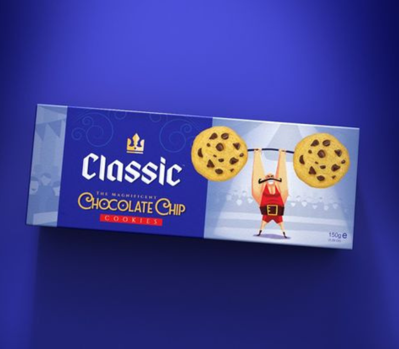
1. Classic Box Design
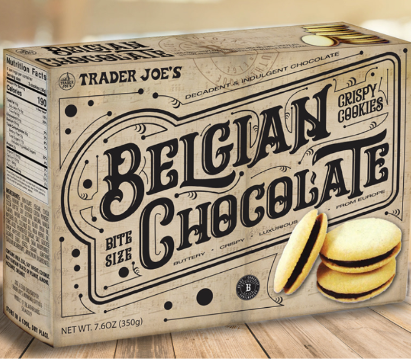
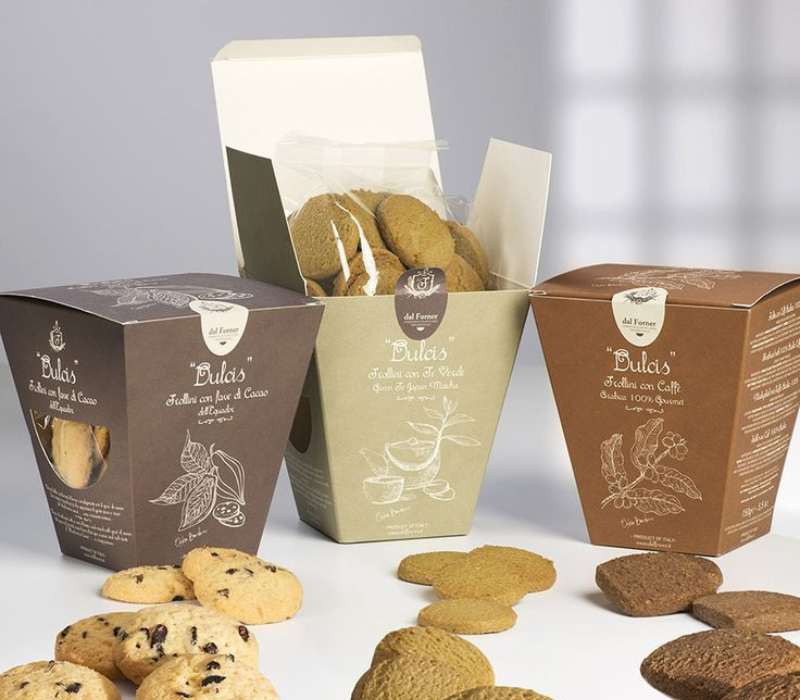
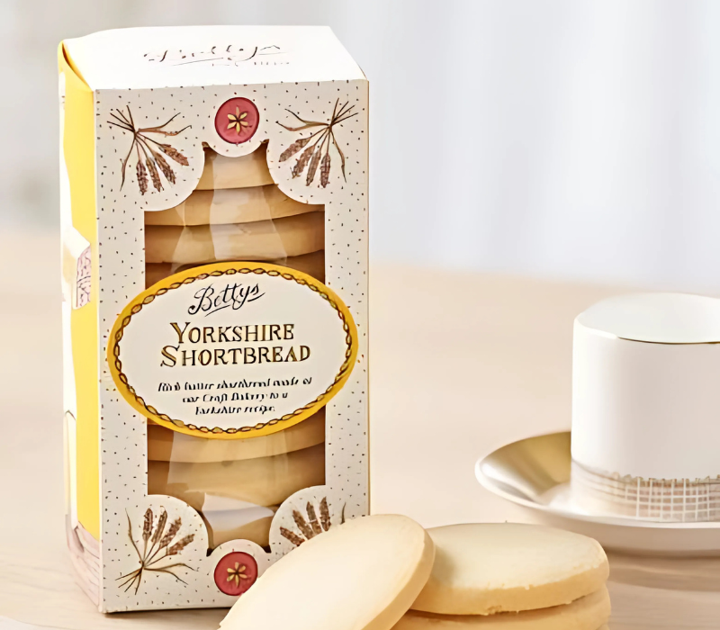
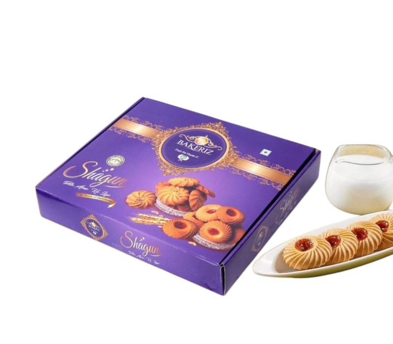
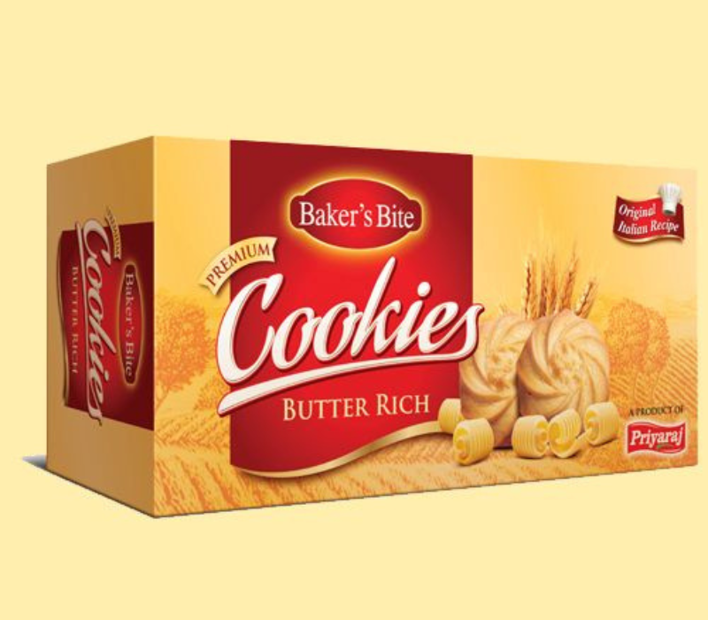
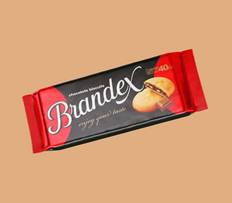
Think of those premium butter biscuits or cookies that come in a sturdy, rectangular box. This type of packaging screams luxury branding.You can apply thick typography and logo design to your box to give it a feeling it stands out. Another feature that is quite helpful is to place more an easily readable and classy label design on the box.
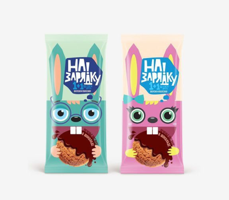
2. Stand-Up Pouches
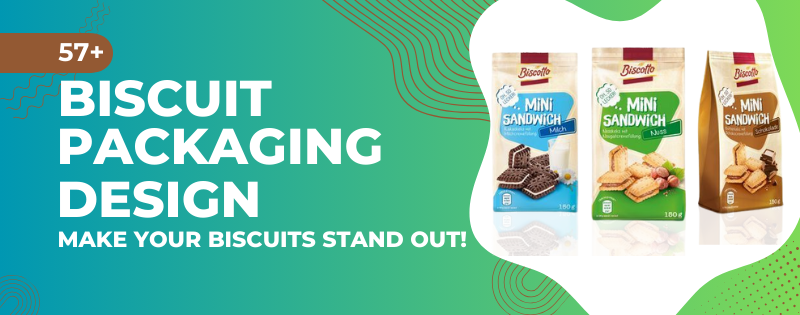
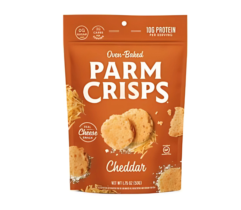
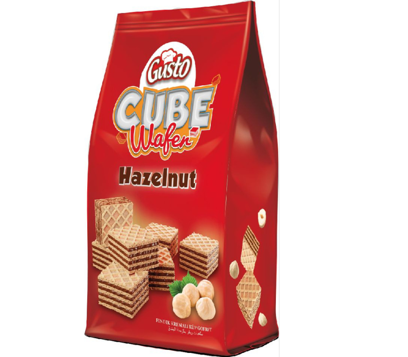
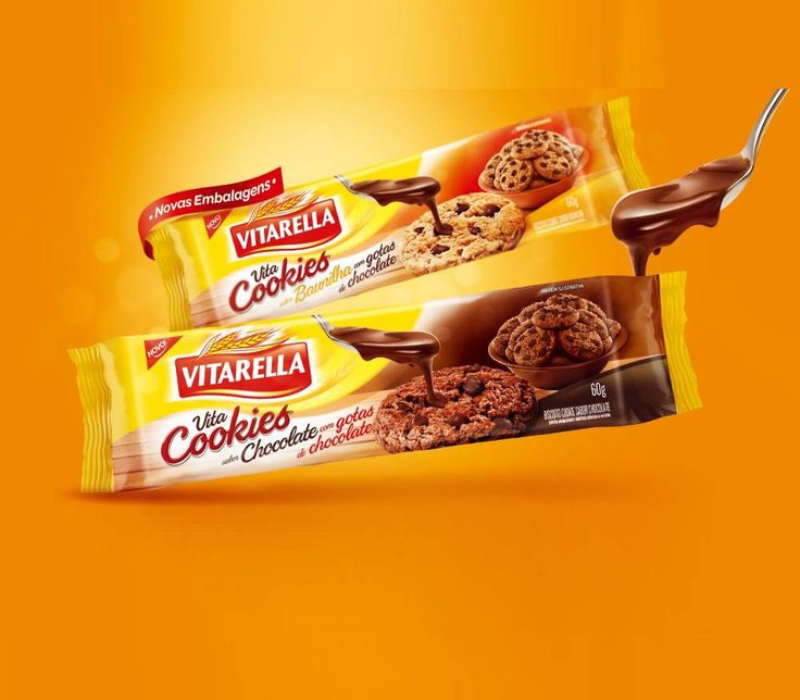
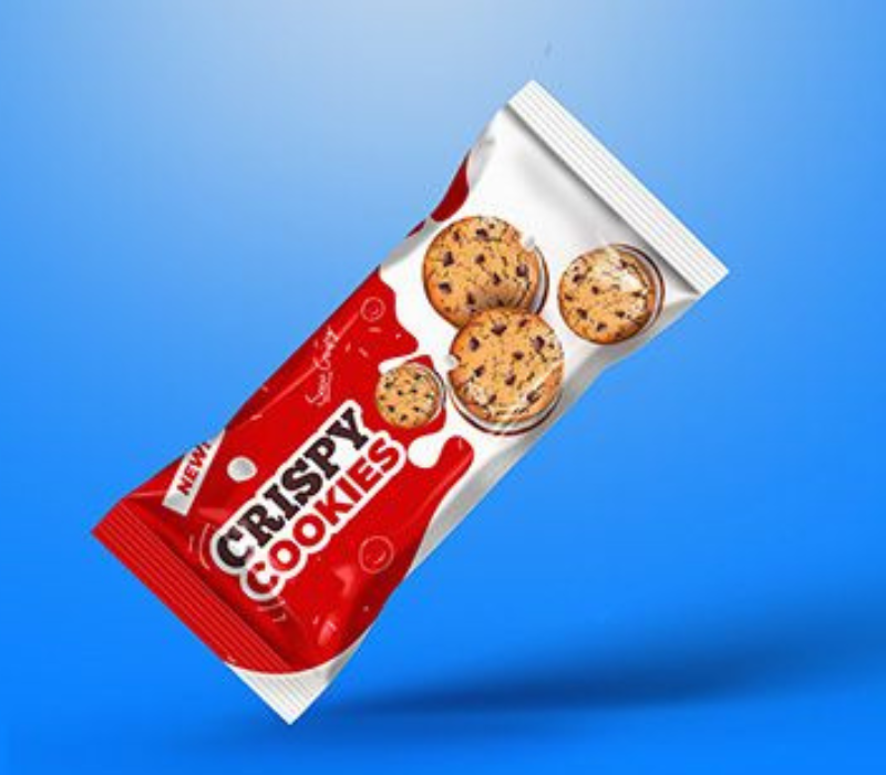
Perfect for modern brands targeting younger audiences. These pouches are great for snacks-on-the-go vibes. They’re light, trendy, and give you plenty of space for a creative design layout. With the right branding elements like vibrant colors and quirky typography, you can make your product Instagram-worthy!
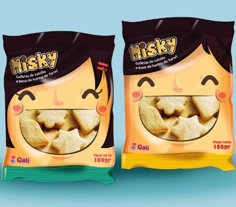
3. Transparent Packaging
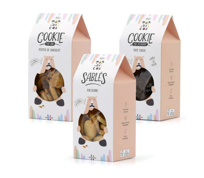
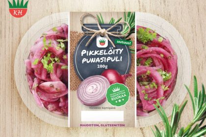
Got biscuits that look as good as they taste? Go for transparent windows or fully clear packaging to let the product speak for itself. Combine the design with elegant label design along with understated logotype design, it becomes a sure fire success.
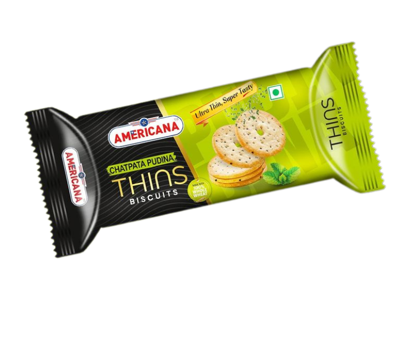
4. Individual Wrappers
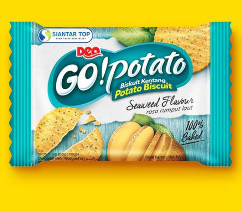
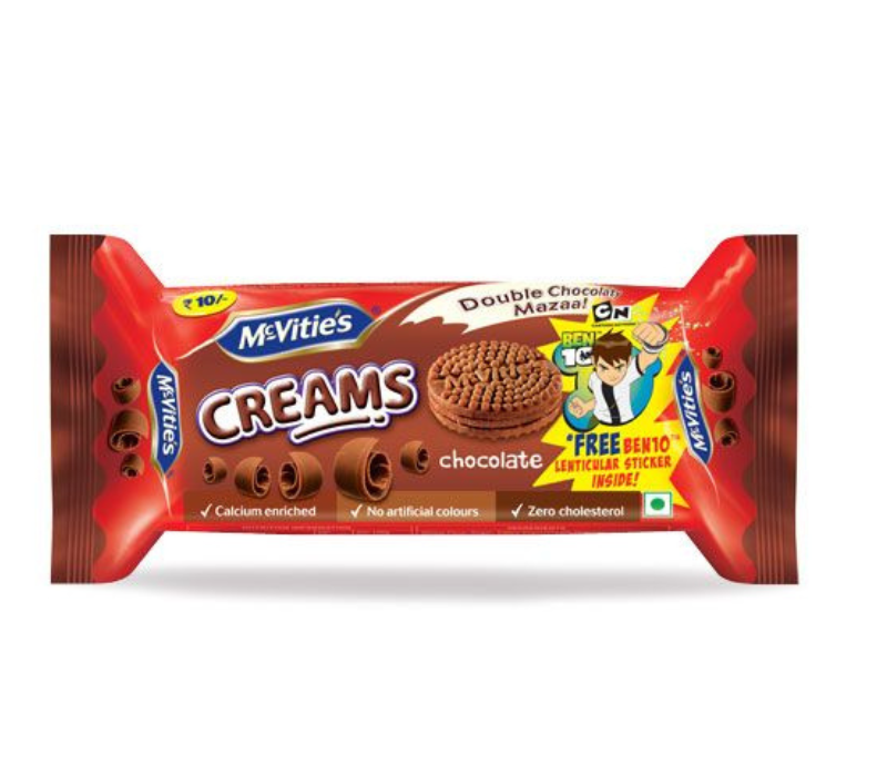
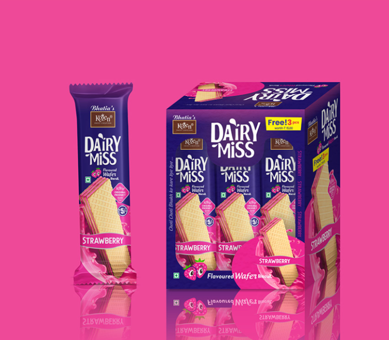
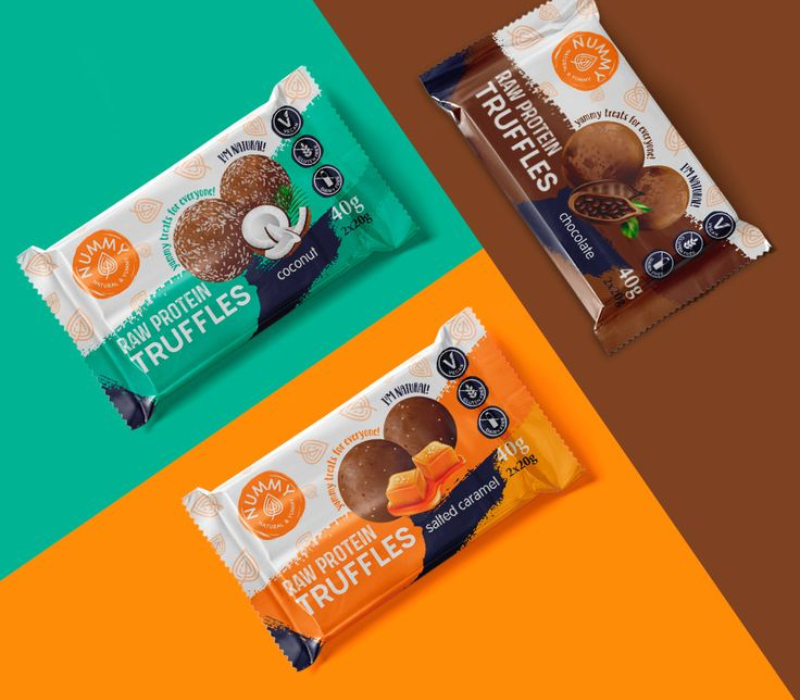
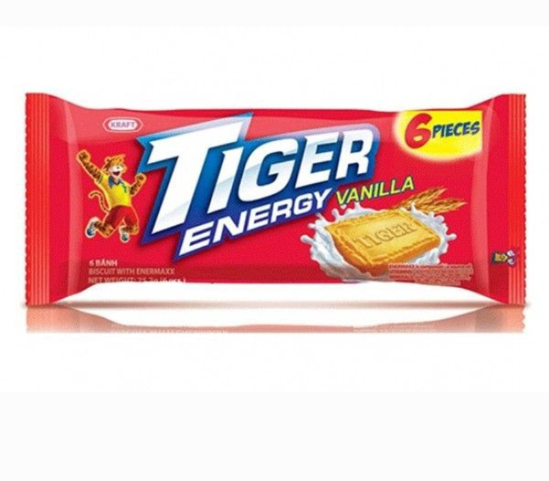
This one’s ideal for single-serve biscuits or mini-packs. It provides the opportunity to try numerous creative designs for each flavor as it becomes entertaining for customers to select the preferred flavor.
5. Cylindrical Tins or Containers
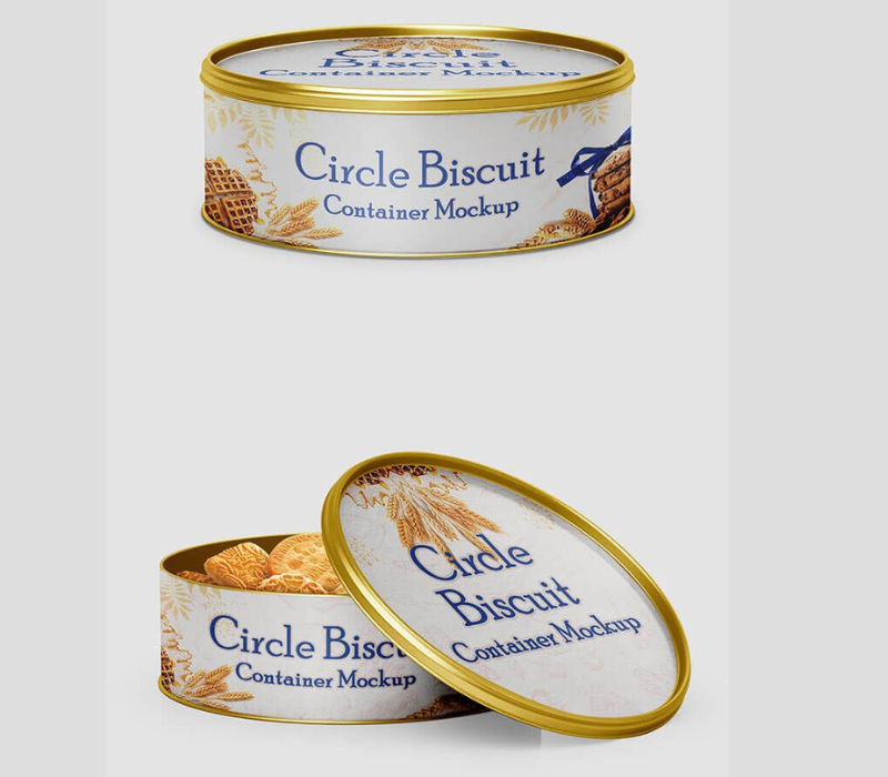
Want a vintage or high-end vibe? Tin packaging can be a game-changer. With A logo design engraved on the tin and intricate patterns on the tin, customer find this type of packaging very suitable to retain.
Things that Make Great Biscuit Packaging Design
1. Eye-Catching Colors
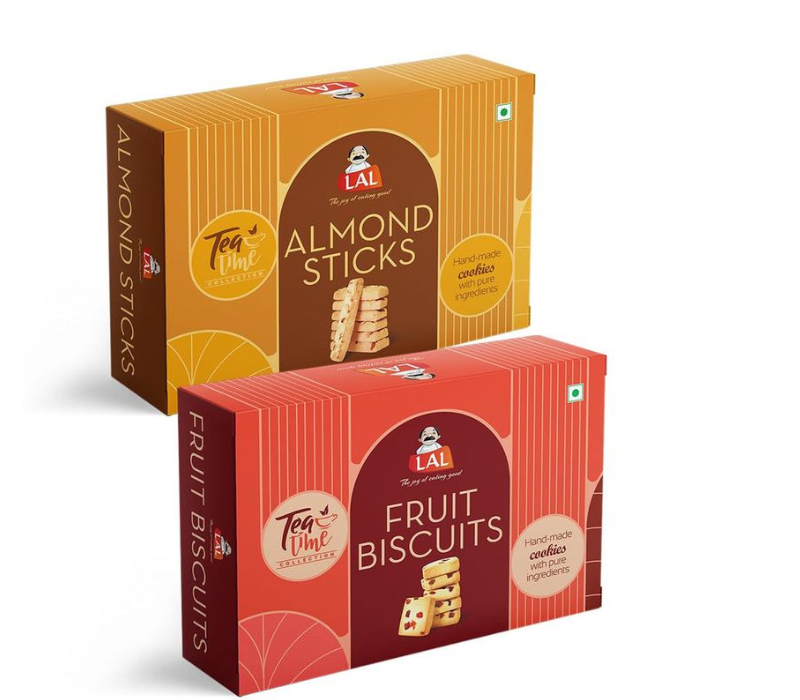
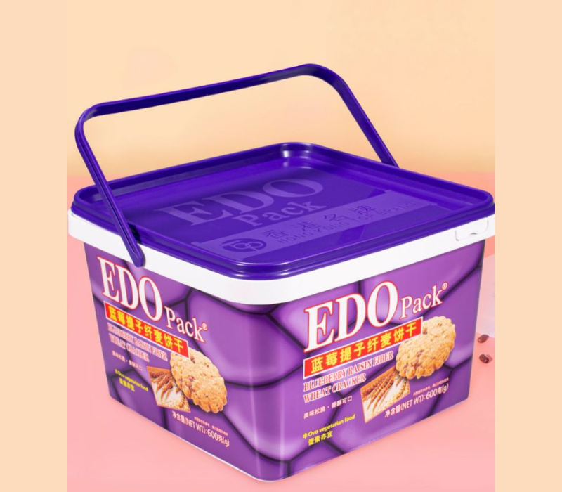
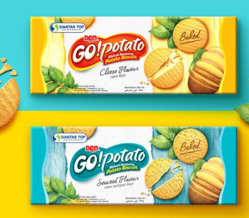
Colors play a huge role in grabbing attention. For biscuits, earthy tones like browns, golds, and creams are popular because they remind people of baked goods. But don’t be afraid to experiment! Bright colors can make your brand look playful and modern.
2. Typography That Speaks Volumes
The way your text looks matters as much as the words themselves. Whether it’s a classy serif font or a quirky handwritten style, your typography should align with your brand vibe. Keep it readable but unique!
3. Story telling Through Design
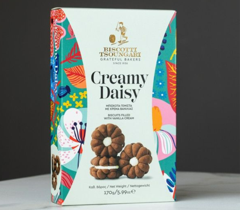
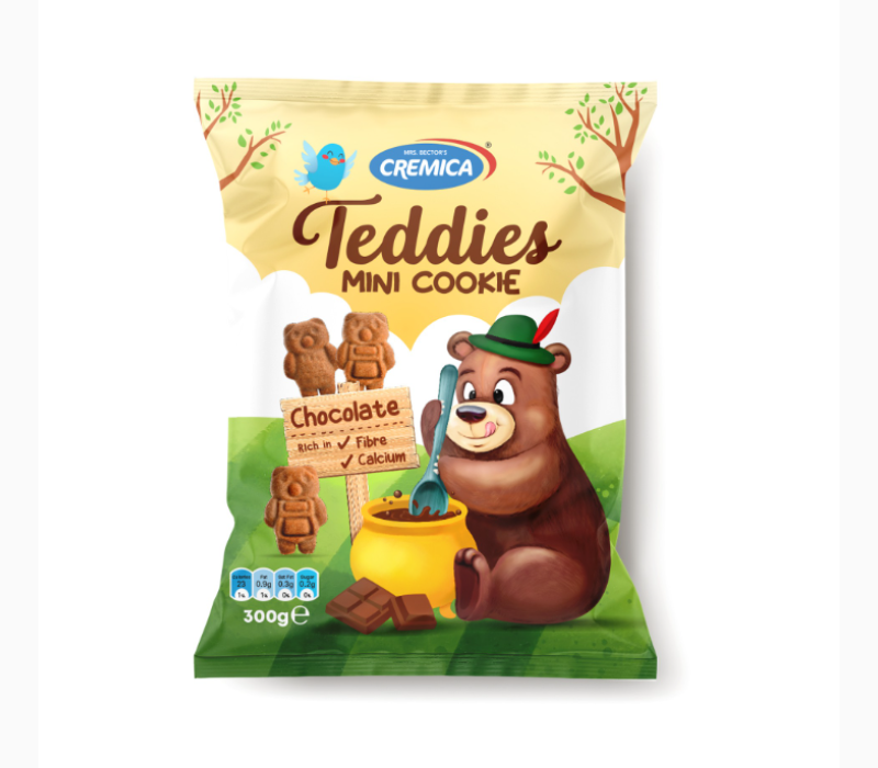
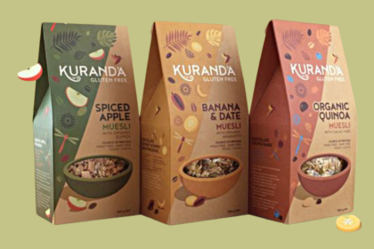
Every biscuit has a story—whether it’s made with grandma’s secret recipe or baked in small batches with love. Illustrate this through the use of figures and other appropriate logos, motifs and even tesseras. What does mean means? People get attached to the stories and that attachment leads to trust to the brand.
4. Your Logo is the Star
Never underestimate the power of a good logo design. It should be front and center on your packaging. A memorable logo helps your brand stick in people’s minds, even if they’re just glancing at the shelf.
5. Consistency is Key
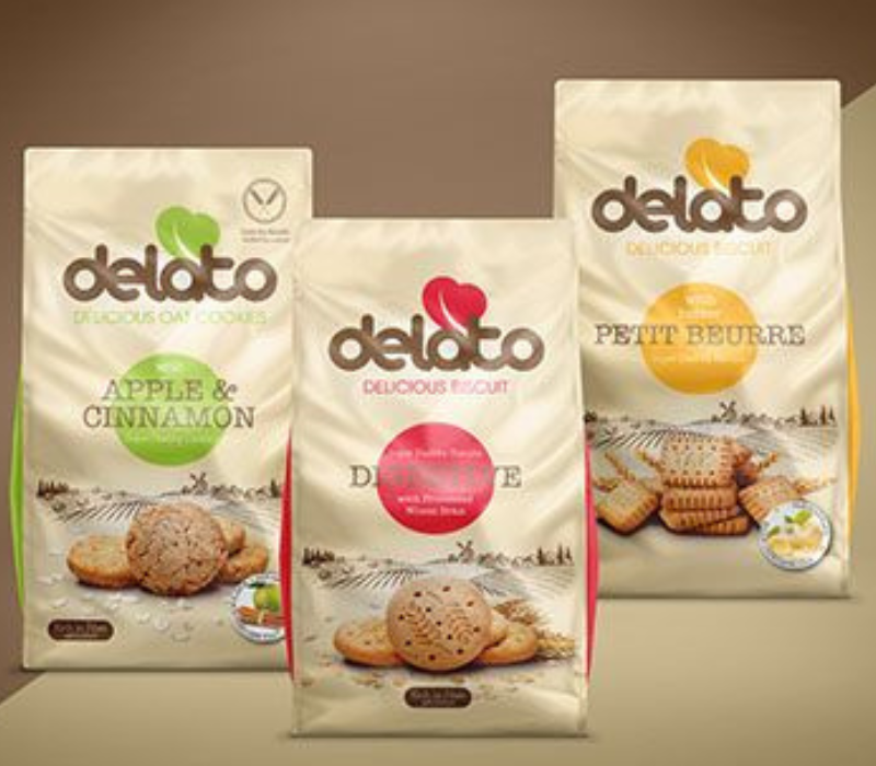
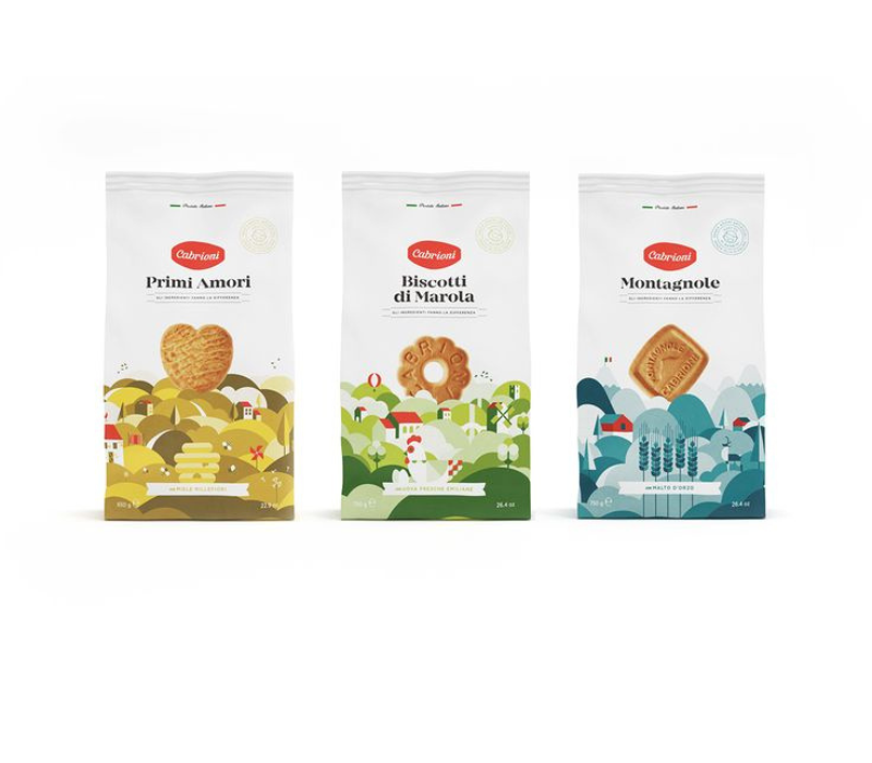
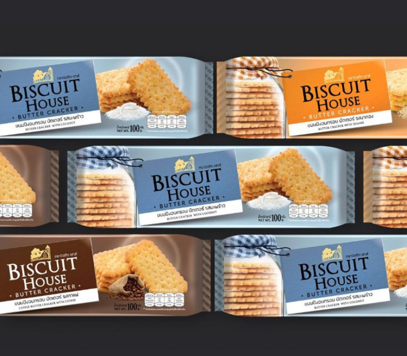
Whether you’re designing for multiple flavors or different biscuit ranges, your packaging should have a consistent theme.This helps in branding or gives your product a face it may be recognized anywhere within the market place.
Why You Shouldn’t DIY Packaging Design for Biscuit Product?
Look, designing biscuit packaging isn’t just about making it look pretty. It’s about creating something that works. A professional branding agency knows how to strike the perfect balance between functionality, aesthetics, and customer psychology.
We understand the nitty-gritty of label design, how to position your logo design, and which colors work for different audiences. Hence instead of having to waste so much time you could just hire the professionals to do it but wait, it is you who makes the best biscuits out there.
Wrapping It Up
Biscuit packaging design is more than just a pretty box or pouch. It’s your first impression, your brand’s story, and your sales booster all rolled into one. From creative design to standout logo design, every detail matters.
If you’re ready to take your biscuit brand to the next level, we’re here to help. Whether you need a sleek label design for premium cookies or a fun, playful look for kids’ biscuits, our team is ready to turn your vision into reality.
So, let’s make your biscuits irresistible—inside and out! Contact us today to discuss your dream biscuit packaging.

