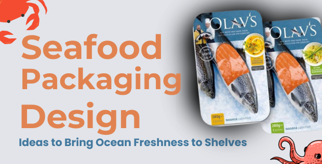
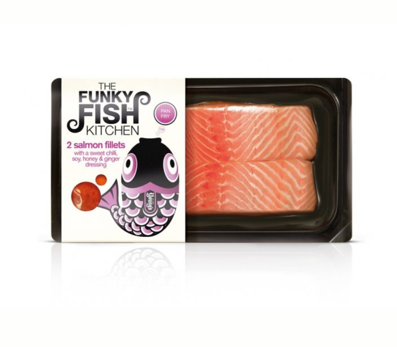
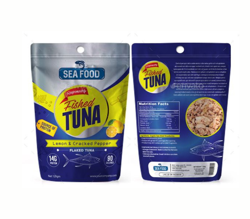
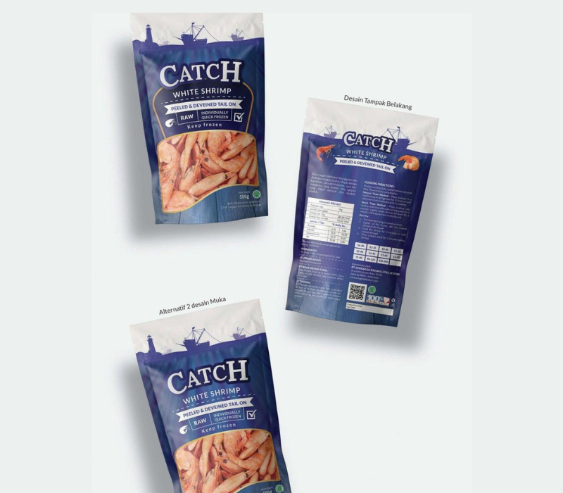
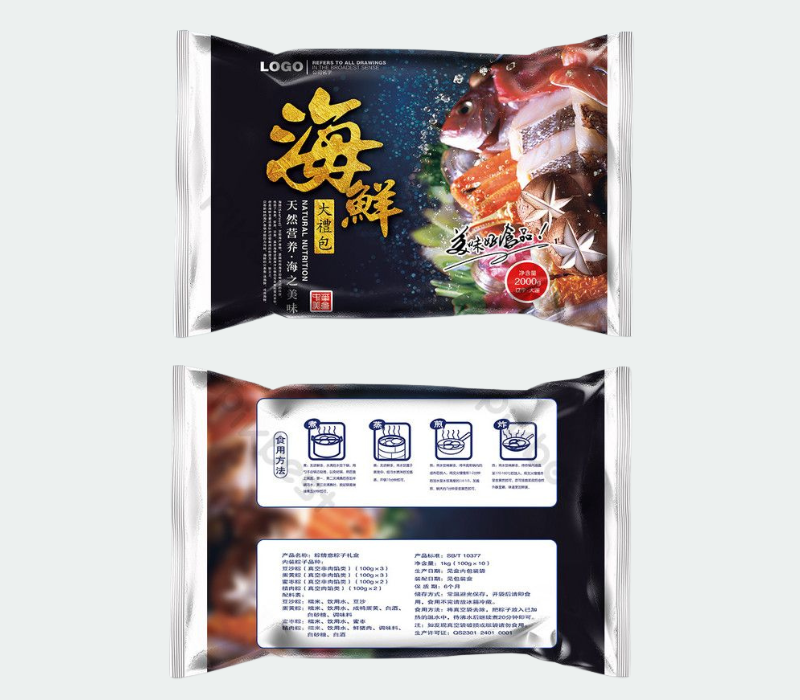
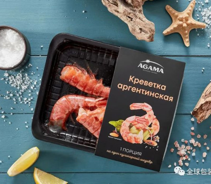
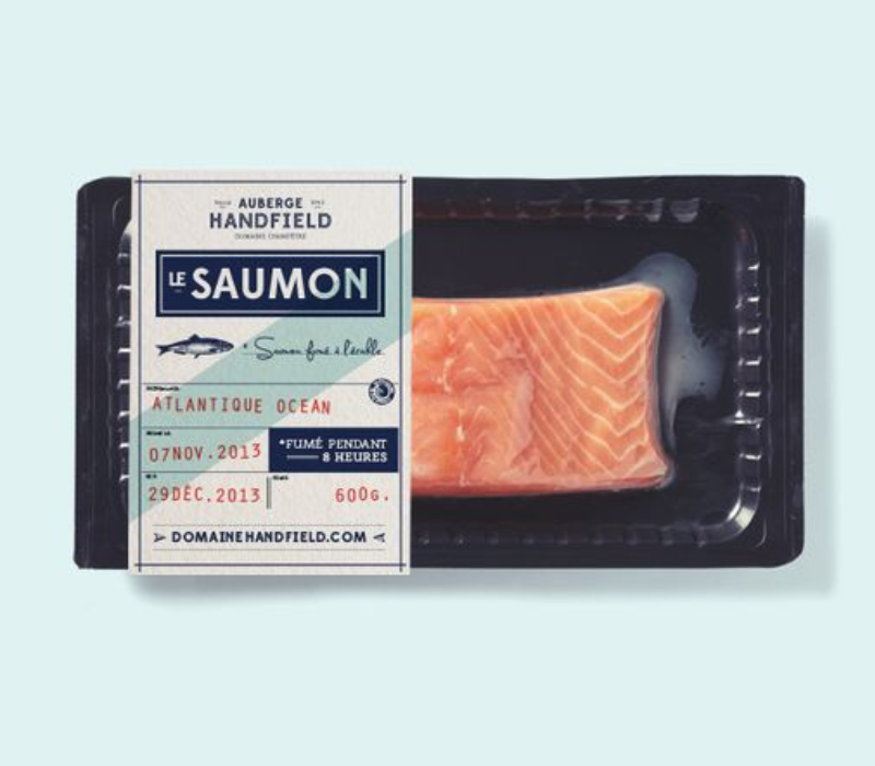
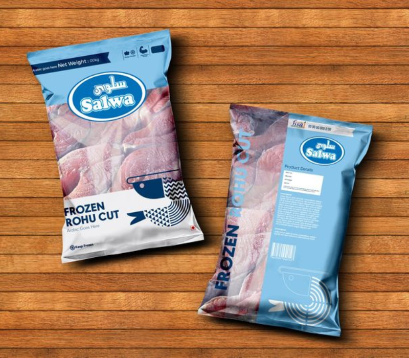
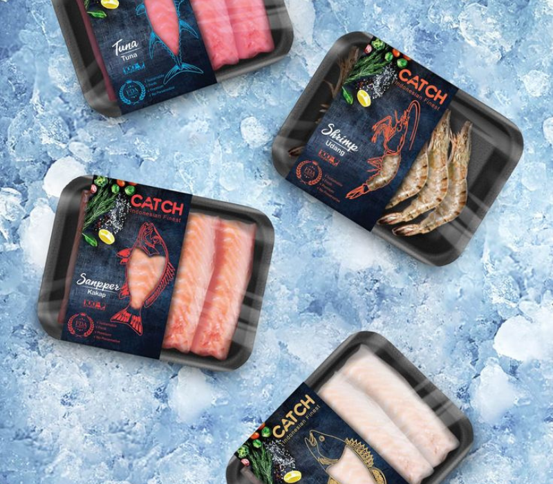
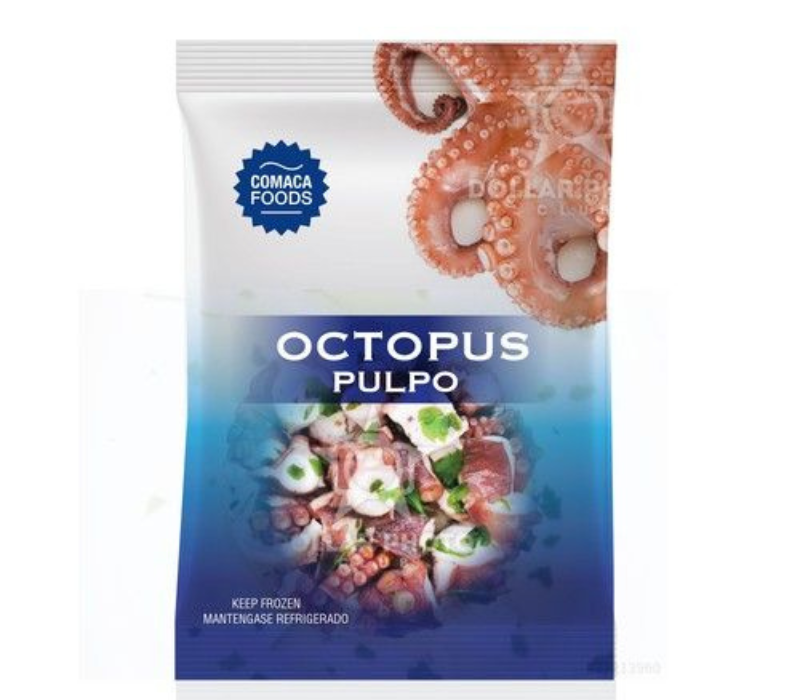
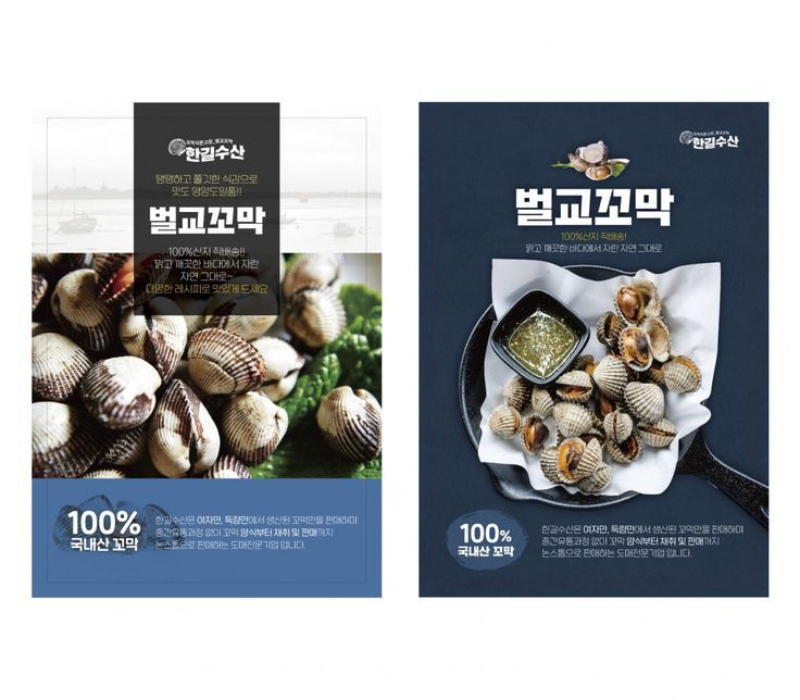
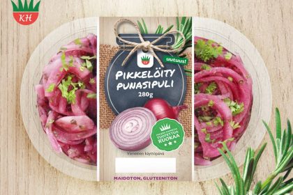
Packaging that’s both eye-catching and practical is key for attracting customers and showing off quality and freshness in the competitive seafood market. Designers have been focusing on sustainability, looks, and transparency to keep seafood fresh on shelves. Whether it’s fish, crab, prawns, or octopus, good packaging should show off the product’s freshness while being sturdy and eco-friendly. Check out these 49+ seafood packaging ideas that bring the feeling of ocean freshness straight to consumers.
Why Packaging Matters in the Seafood Industry?
In the seafood world, packaging isn’t just about looks. It’s about showing freshness and quality. Great packaging design doesn’t just catch the eye—it helps with safe storage, keeps the product fresh longer, and holds in nutritional value.
Packaging Design that highlights freshness and uses sustainable materials can help seafood brands earn trust from eco-conscious buyers. Today’s seafood brands need to balance visual appeal with practical use in their packaging.
Core Elements of Effective Seafood Packaging Design
Creating packaging that captures the ocean’s freshness and appeals to health-conscious customers comes down to a few key design elements that seafood brands should keep in mind.
Transparency, standout lettering, and using strong materials can make the design better while ensuring the seafood stays fresh.
– Durable, Sustainable Materials
Durable packaging is a must to prevent spoilage, leaks, or contamination that could affect the product’s quality. Using moisture-resistant materials like biodegradable plastics, recyclable paper, or bio-based resins helps keep seafood fresh and safe.
Sustainable materials also cut down on environmental impact and make the brand more attractive to eco-friendly shoppers. Sturdy, eco-friendly packaging shows that a brand cares about quality and the planet.
– Color Palette to Evoke Freshness
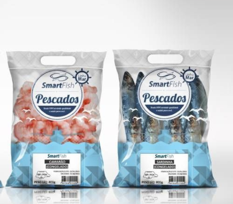
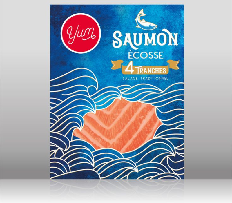
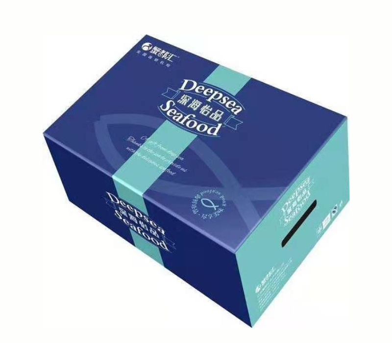
Color is a huge part of setting the right feel for food packaging design. Ocean-inspired shades like blue, turquoise, and deep green bring a sense of freshness and purity, connecting the product to the sea.
Adding colors like white or light gray gives a clean, fresh look, while touches of red or orange can hint at the nutritious value of the seafood. A well-chosen color scheme highlights freshness and boosts the brand’s image.
– Imagery
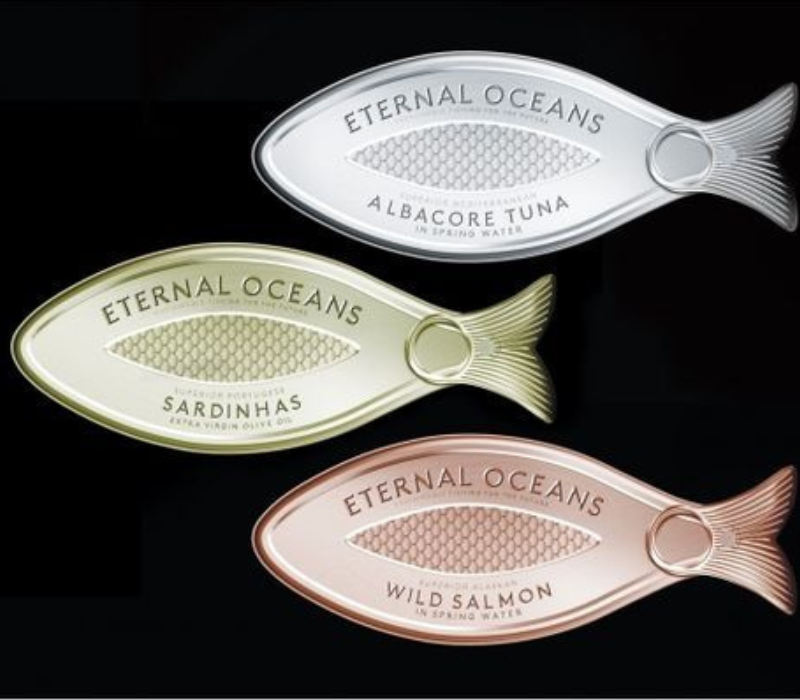
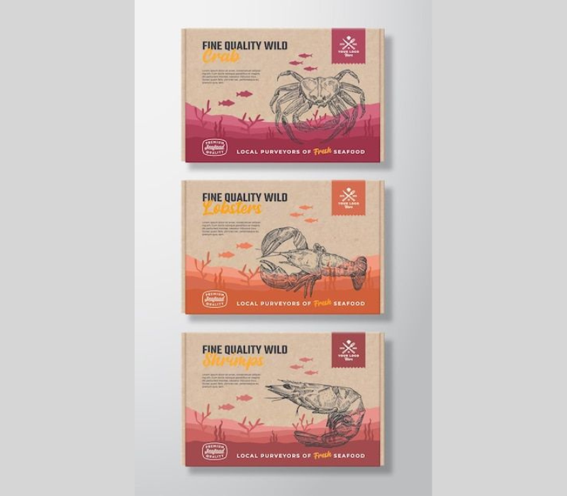
Imagery can make or break seafood packaging. High-quality photos of fresh fish, prawns, crab, and other seafood show the freshness customers want. Ocean-themed visuals like waves or sea creatures add to the experience.
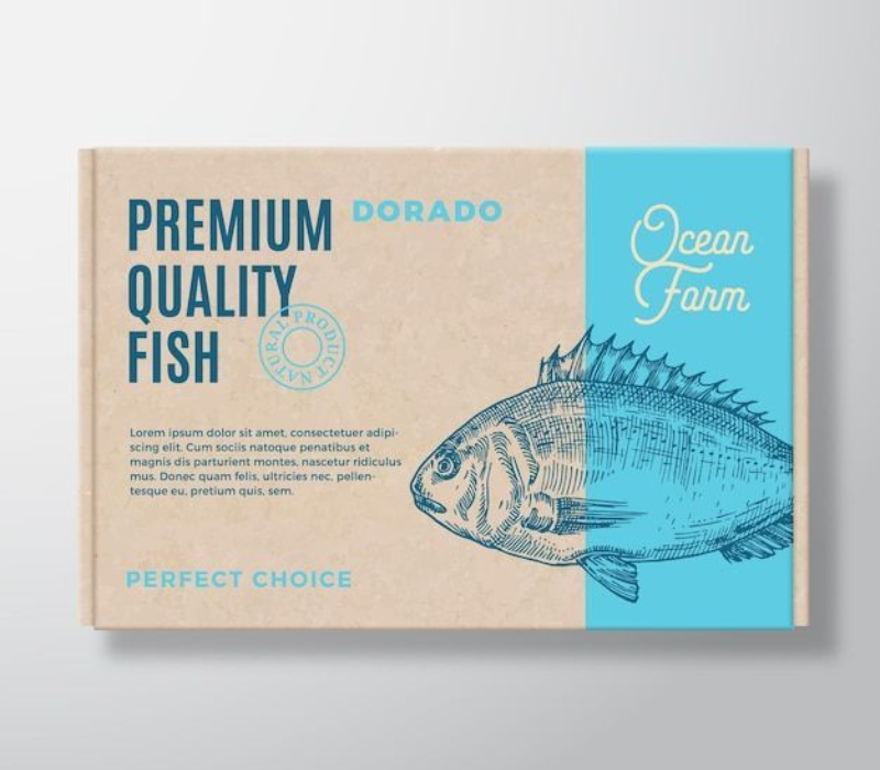
Illustrations and patterns featuring underwater scenes or nautical elements can transport customers to the ocean and make the product more appealing.
– Typography
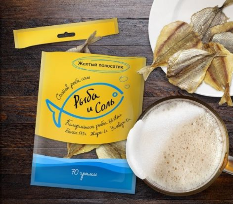
Typography might not be the first thing that comes to mind, but it’s important in seafood packaging. Clean, bold, and easy-to-read fonts show off the simplicity and natural feel of the seafood.
Fonts with a vintage or rustic touch can remind customers of traditional fishing, adding a sense of authenticity. Typography should be readable and match the overall look of the packaging.
– Nutritious Ingredients Highlight
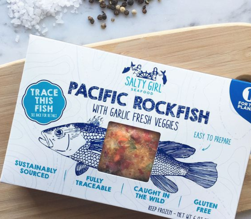
Today’s shoppers care more about health than ever, so seafood brands that highlight the protein and nutrients in their products can grab attention. Labels like “High in Protein,” “Rich in Omega-3,” or “Wild-Caught” work as quick callouts that point out the product’s benefits.
Showing nutritional info upfront not only informs customers but also builds trust and encourages healthier choices.
– Transparency to Showcase the Product
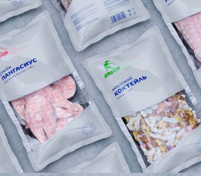
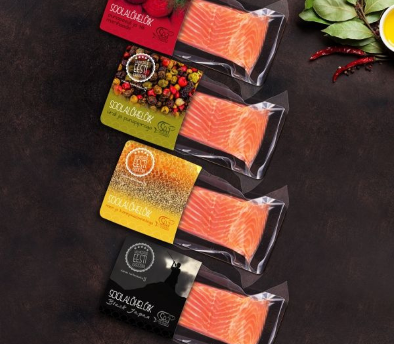
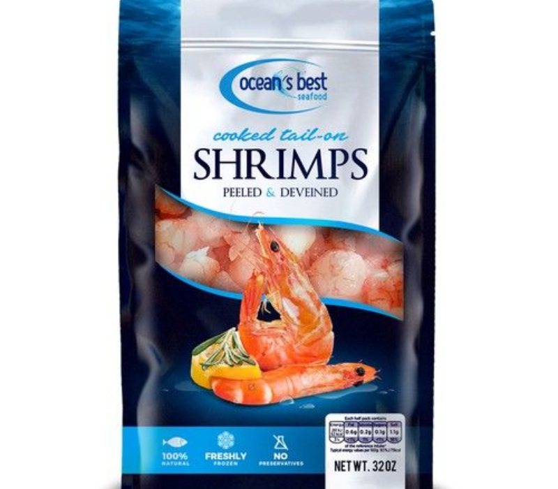
One of the best ways to show freshness is by using transparent sections in the packaging so customers can see what’s inside. Clear windows let them check out the seafood’s texture, color, and quality.
This transparency builds trust and is especially popular in fresh or frozen seafood packaging, giving a premium feel and backing up the brand’s promise of “ocean freshness.”
– Frozen-Friendly Design
Seafood packaging needs to hold up under freezing temperatures to keep freshness longer. Packaging for frozen seafood should be made of materials that don’t warp, crack, or become brittle in the cold.
Secure sealing methods, like vacuum-sealed or airtight bags, are great for frozen products. They help prevent freezer burn and preserve the seafood’s taste and texture. A frozen-friendly design ensures the seafood reaches customers in top shape, showing the brand’s commitment to quality.
Conclusion
As the seafood market grows, creative packaging is more important than ever to stand out on crowded shelves. Packaging that blends function with attractive design—using eco-friendly materials, ocean-inspired colors, clear windows, and durable options for frozen items—can set a brand apart.
By focusing on sustainability, durability, and transparency, brands can create packaging that appeals to health-minded and eco-conscious customers while keeping the seafood fresh. Ready to make your seafood brand stand out? Connect with the top-rated brand design experts to make it possible for you and bring the feeling of ocean freshness to your seafood brand.

