Smoothie Packaging Design
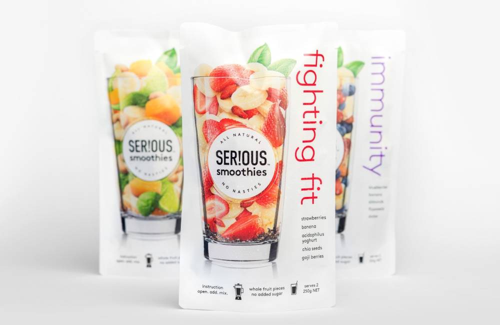
We all know in recent times, the smoothie market has picked up due to the fact of a healthy lifestyle in the picture. There are multiple varieties of it, from fruits, vegetables to combinations, but the packaging design should highlight its ingredients and freshness emotion through it.
Best Smoothie Label Design
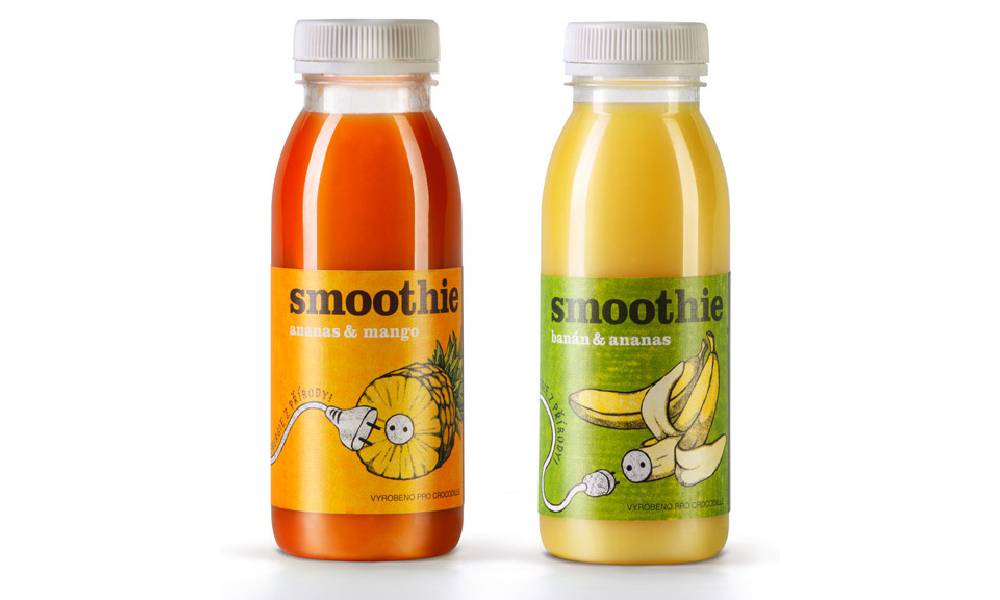
A significant portion of the bottle is kept transparent so that the real product is visible; hence it should correctly coordinate the label with the background. The value proposition should reflect on the packaging if its organic form, script logotype, hand-drawn illustrative detail, bright contemporary colour and energy – enhanced by plenty of white space. A neat, playful, die-cut tree element will effectively convey honesty, natural ingredients and premium quality with a more proprietary finish.
![]()
![]()
Also, Read Amazing Pop Corn Packaging Design 2021
![]()
![]()
Amazing Smoothie Packaging Design Ideas
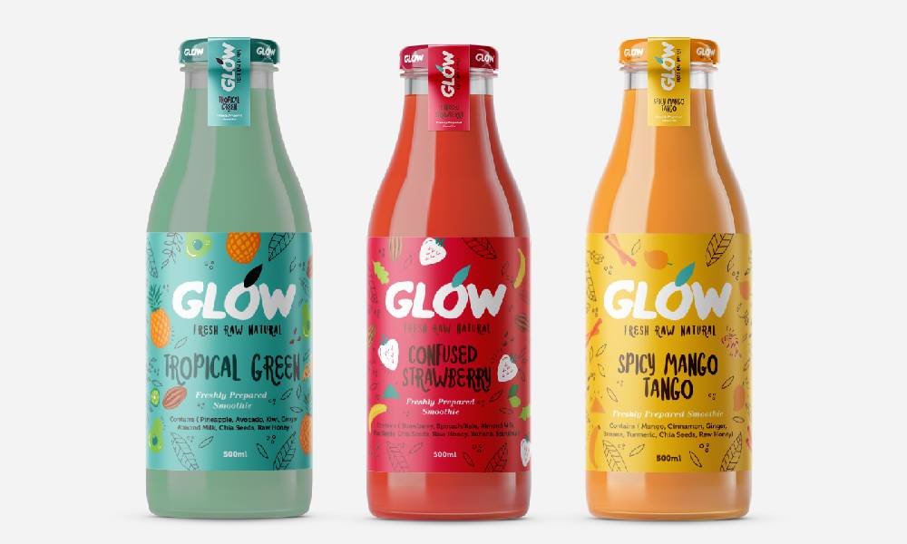
source: packagingoftheworld.com/2017/08/glow.html
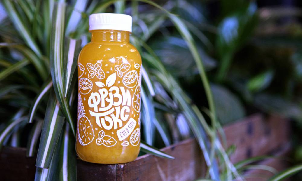
source: behance.net/gallery/75986351/Smoothie-Fruzitox-Logo-Design-and-Branding?
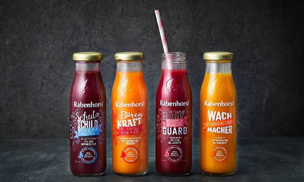
source: packagingoftheworld.com/2020/08/smoothies-rabenhorst.html
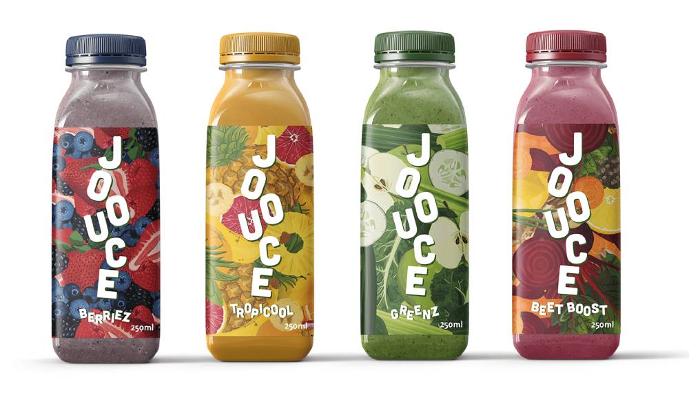
source: behance.net/gallery/112248747/JOOUCE-smoothie-packaging
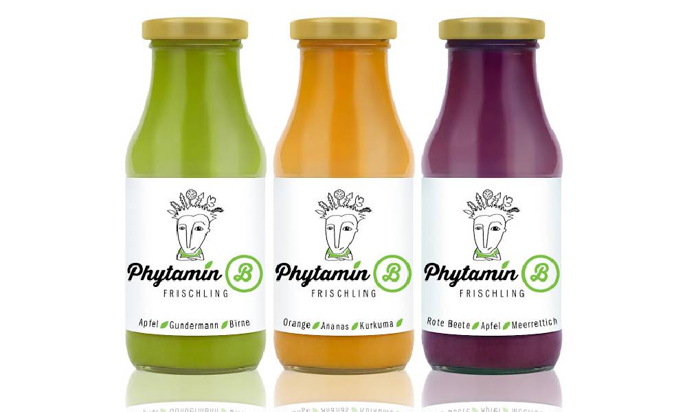
source: packagingoftheworld.com/2015/09/frischling.html
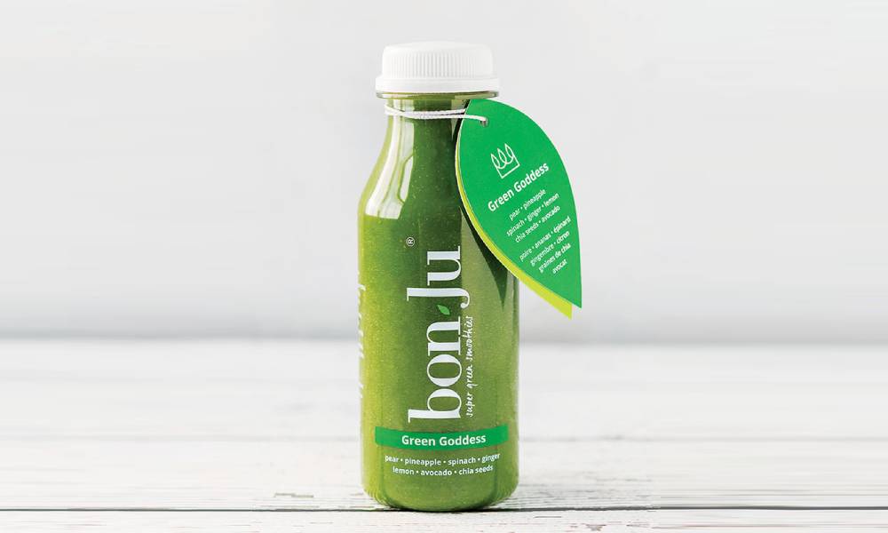
source: packagingoftheworld.com/2020/05/bonju-super-green-smoothies.html
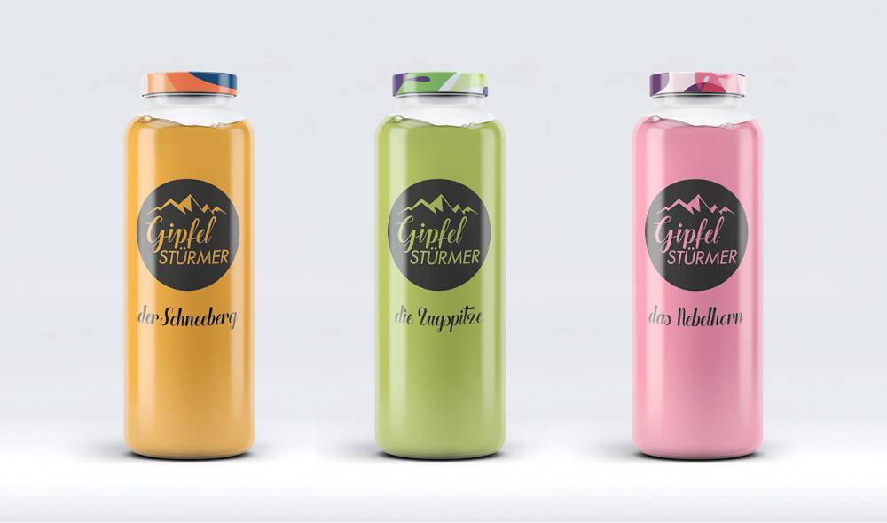
source: behance.net/gallery/96989175/Gipfelstuermer-Smoothie
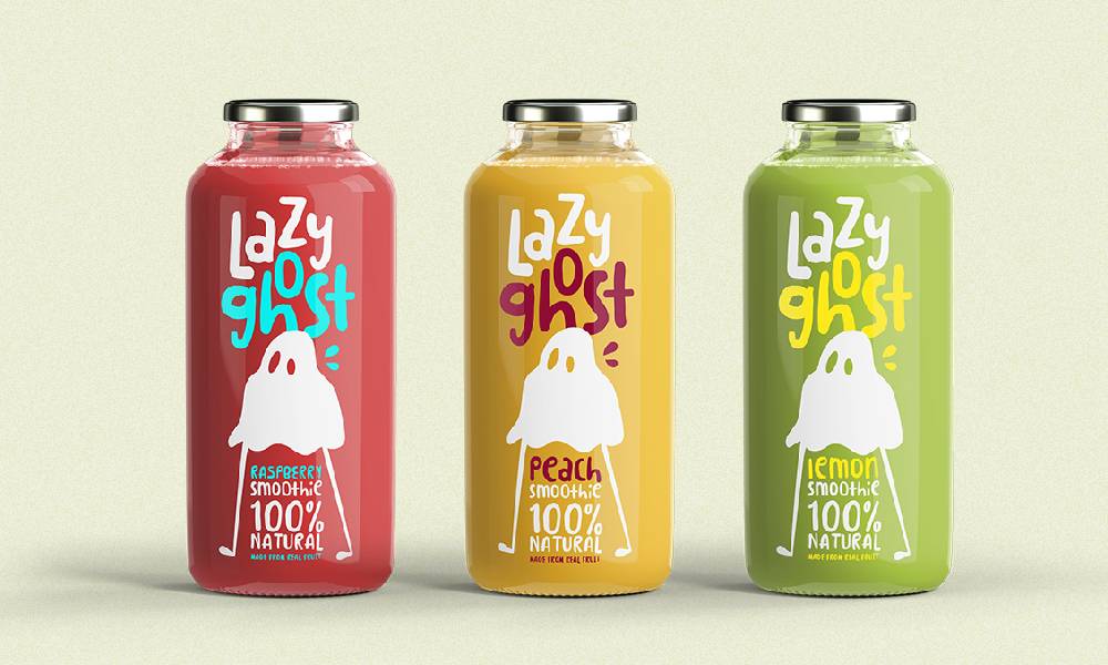
source: packagingoftheworld.com/2016/11/lazy-ghost-concept.html
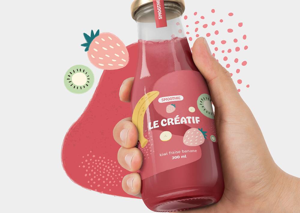
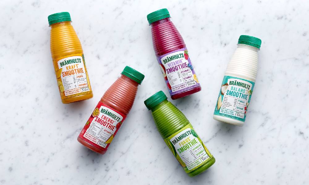
source: packagingoftheworld.com/2018/08/bramhults-redesigned.html
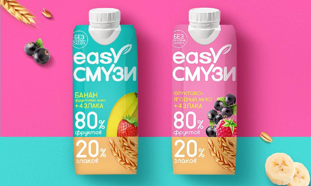
source: packagingoftheworld.com/2020/06/easy-smoothie.html
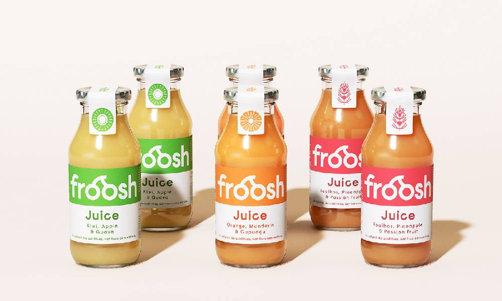
source: behance.net/gallery/97582409/Froosh-Smoothie
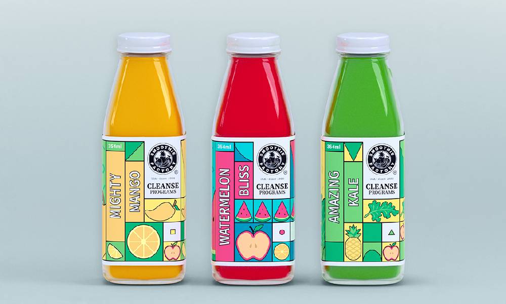
source: behance.net/gallery/101020895/SMOOTHIE-FACTORY-packaging-redesign

