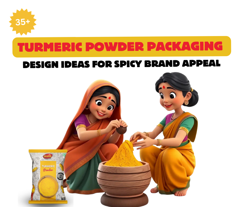
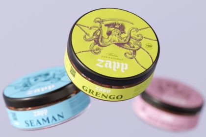
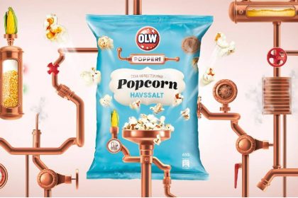
You probably heard of the health benefits of turmeric and how it has become increasingly incorporated in various food products and dietary supplements; and did you know that the global market for turmeric is expected to grow to USD 5.6 billion by 2027? BECAUSE turmeric powder resides in so many kitchens, it does not suffice to offer only the best spice but it must also look better than all the others; its packaging should leap off the shelves.
As part of this blog, we have compiled 35+ turmeric powder packaging design examples that will assist you in developing a perfect theme that will trigger the customer’s buying spirit to go for your product with its spicy image. If you are using warm, golden tones associated with purity and health or graphics for younger targeted audience, extra design can go a long way in boosting the sales.
These ideas will help you get past the basics of how to design your spice packaging and spark creativity from simple to wild designs for your product packaging. Now it is time to understand how to make your turmeric packaging the spice it really is with the help of design!\
What are the Basic Requirements of Turmeric Powder Packaging Design?
The basic requirement of turmeric powder packaging design include air-tight seal to maintain freshness, durable material to prevent contamination, clear labeling with product details and brand information, attractive graphics to catch customer attention, resealable option for convenience, and eco-friendly materials to appeal to environmental conscious consumers. Packaging should also protect from light and moisture.
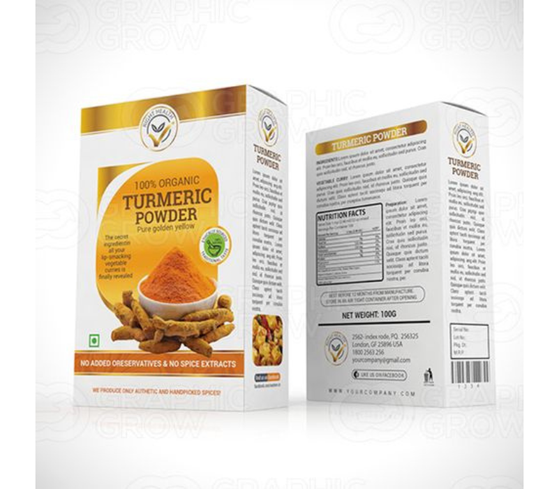
1. Maintaining Visual Appeal to Highlight the Spice’s Essence
Turmeric powder needs proper packaging to stay fresh. It must protect from moisture to avoid clumping and spoilage. Laminated flexible pouches or co-extruded films are great options. Packaging should also be durable to handle transportation and not break or leak.
Popular choices like plastic and aluminium pouches work well because of their strength. Bright, vivid colours that show the essence of turmeric can attract attention. Fonts need to be dynamic, using a mix of serif and sans-serif to keep it interesting and easy to read. The design should also reflect the product’s high quality.
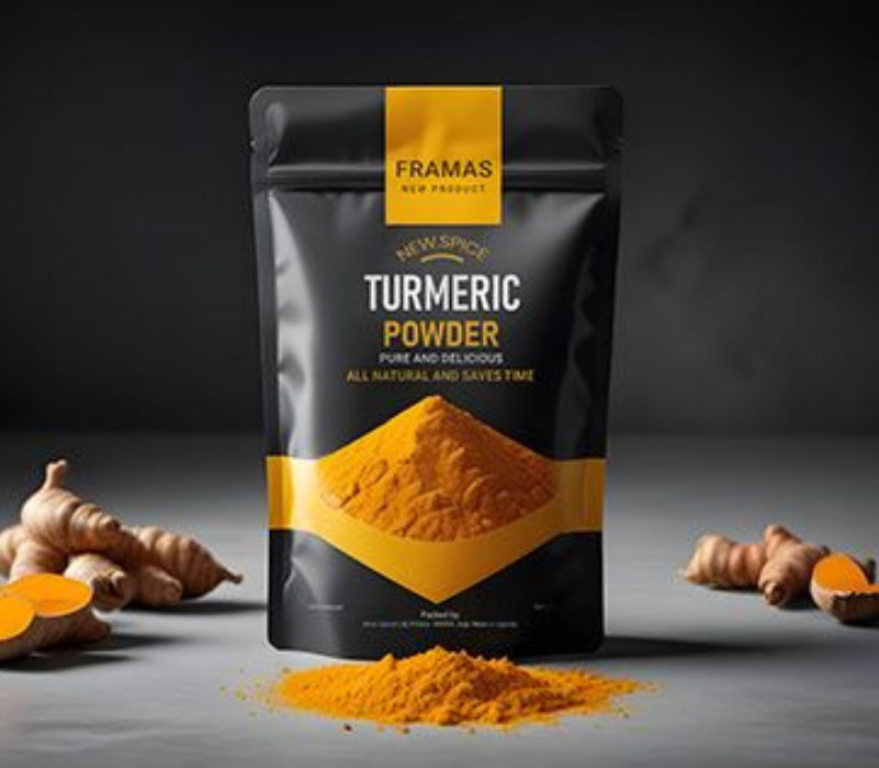
Source: https://in.pinterest.com
Source: https://in.pinterest.com
2. Infusing Cultural Touchpoints
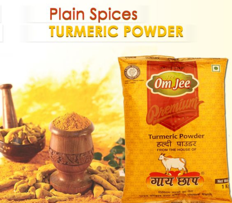
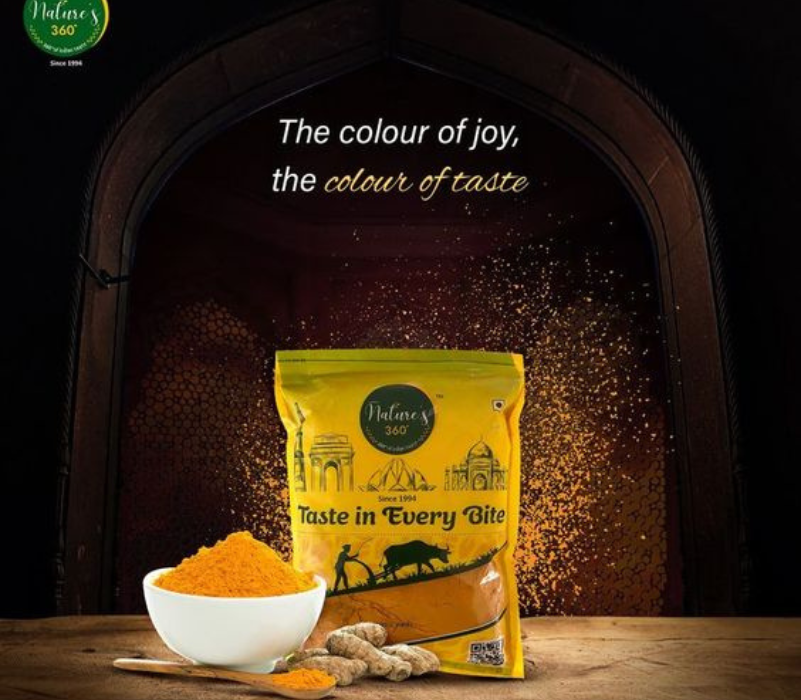
When designing turmeric powder packaging that infuses cultural touchpoints, several basic requirements should be considered to effectively highlight the spice’s rich heritage and appeal to consumers. Incorporate designs that reflect the cultural heritage of turmeric, such as Indian motifs or patterns that signify its historical and medicinal importance in various cultures.
This can create a strong emotional connection with consumers. Use the packaging to tell stories about turmeric’s origins, its role in traditional practices, and its significance in culinary and medicinal contexts. This could include images or text highlighting its use in Ayurvedic medicine or cultural rituals. Utilize vibrant colors like yellow and orange that represent turmeric’s essence. These colors not only attract attention but also symbolize warmth, health, and vitality associated with the spice.
Source: https://in.pinterest.com
Source: https://in.pinterest.com
3. Ensuring Readability and Clarity of Product Information
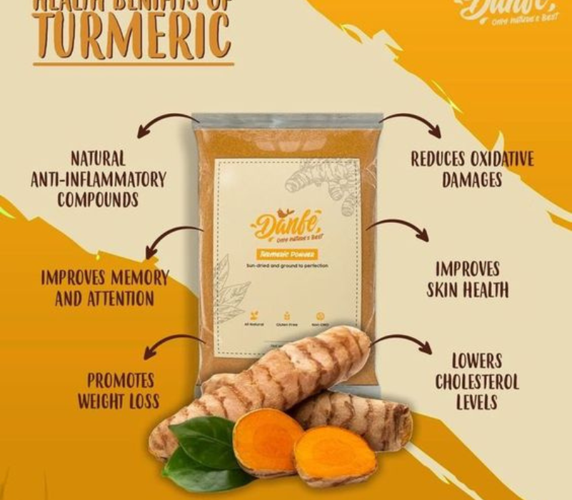
When designing packaging for turmeric powder, ensuring readability and clarity of product information is essential for consumer trust and effective marketing. Use high-quality packaging materials that protect against moisture, light, and air.
Triple-laminated pouches or vacuum-sealed bags are effective in maintaining freshness and preventing spoilage. If appropriate, consider using clear sections in the packaging to allow consumers to see the product inside, reinforcing confidence in quality.
Source: https://in.pinterest.com
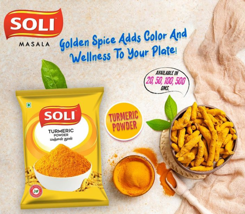
Source: https://in.pinterest.com
4. Choosing Appropriate Colors and Graphics
Utilize bold colors like yellows and oranges that reflect turmeric’s natural hue. These colors not only attract attention but also symbolize warmth, health, and vitality associated with the spice.
Incorporate colors that resonate with the cultural significance of turmeric, such as earthy tones or traditional Indian colors that evoke authenticity and heritage.
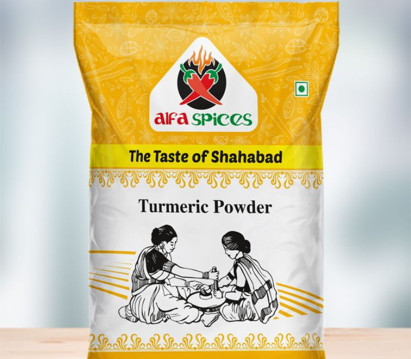
Source: https://in.pinterest.com
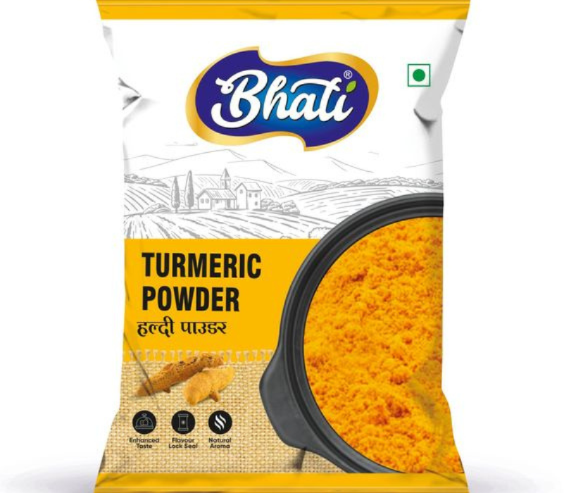
Source: https://in.pinterest.com
Let’s Go through these 35+ Turmeric Powder Packaging Design Ideas for Inspiration
Explore over 35 turmeric powder packaging designs for inspiration. These designs are visually appealing, incorporating vibrant colors, natural themes, and modern aesthetics to capture consumer attention. Many use eco-friendly materials and unique shapes to stand out on shelves. They blend traditional elements with contemporary styles, reflecting the product’s organic and health benefits.
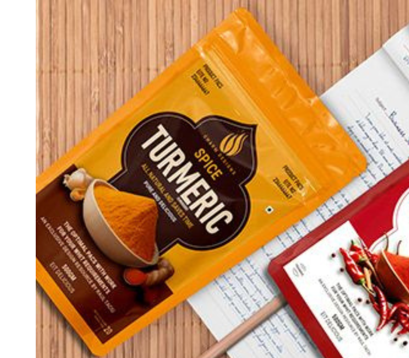
1. Traditional Indian Theme
Integrate traditional Indian art styles such as Madhubani, Warli, or block prints into the packaging design. These patterns can add depth and cultural significance, making the packaging visually appealing and meaningful .
Use motifs that represent fertility, prosperity, or spirituality, which are often associated with turmeric in Indian customs. For instance, incorporating imagery of turmeric roots or flowers can enhance the theme.
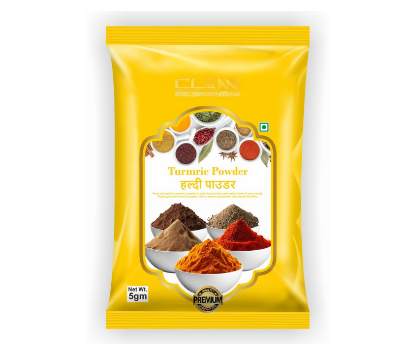
Source: https://in.pinterest.com
Source: https://in.pinterest.com
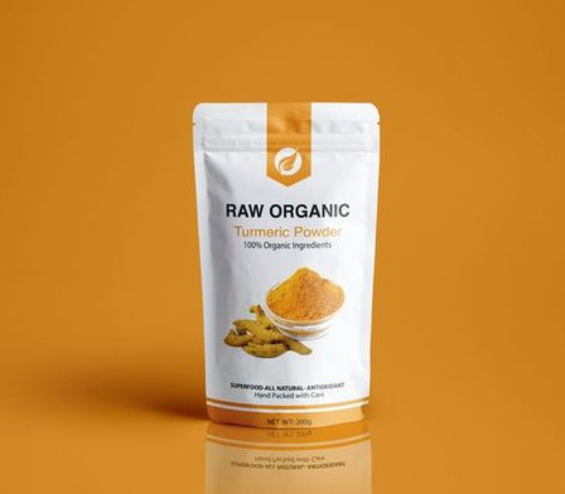
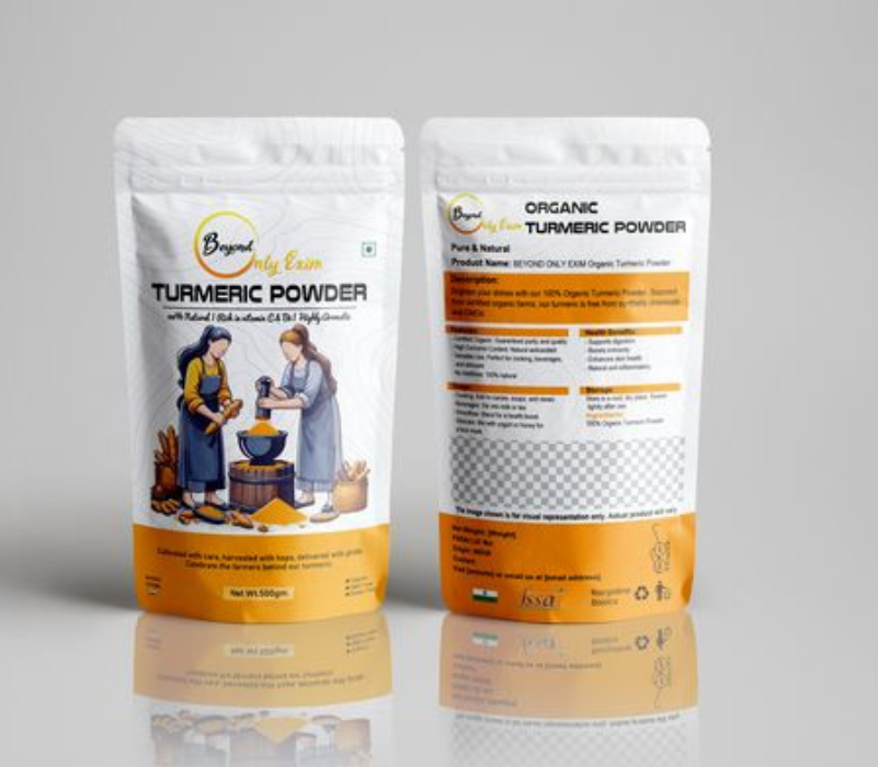
2. Luxury Packaging with Gold Accents
Use deep, luxurious colors such as royal purple, emerald green, or rich burgundy as the primary background. These colors can evoke a sense of sophistication. Integrate gold foil stamping for the brand name, logo, or decorative elements.
Opt for materials like matte or glossy finishes that feel substantial and luxurious. Consider using soft-touch laminates for a tactile experience that enhances perceived value.
Source: https://in.pinterest.com
Source: https://in.pinterest.com
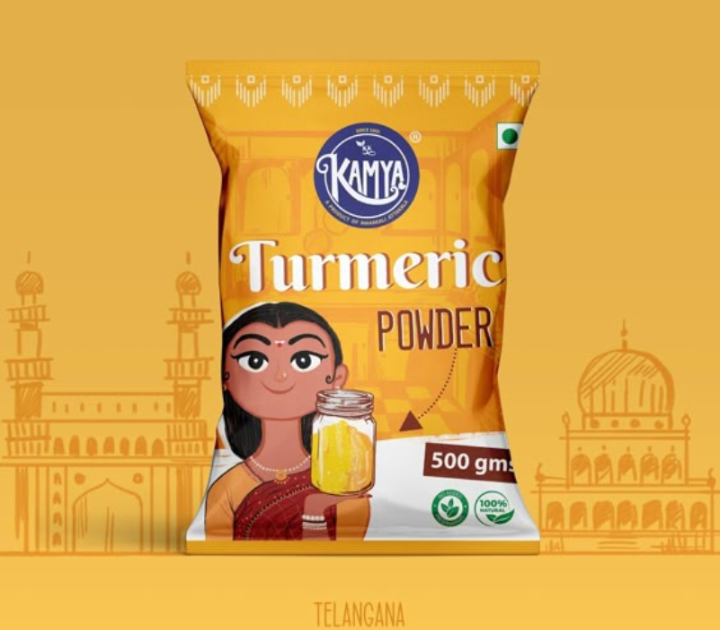
3. Cultural or Ethnic Patterns
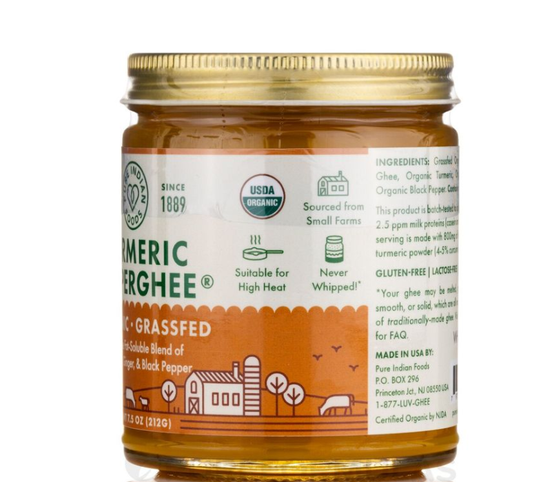
Incorporate styles like Madhubani or Warli art, which reflect regional heritage and storytelling through visuals. This can create a strong connection with consumers who value authenticity and tradition.
Symbols associated with spirituality and health, such as lotus flowers or sacred geometry. These can resonate with consumers who appreciate the medicinal properties of turmeric in Ayurvedic practices.
Source: https://in.pinterest.com
Source: https://in.pinterest.com
4. Premium Glass Jars with Metal Lids
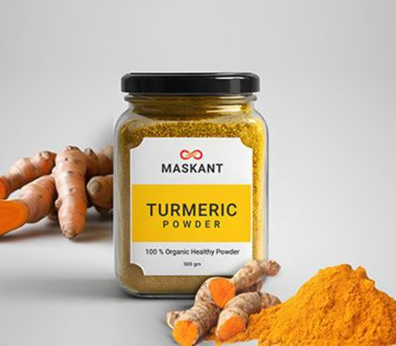
Choose sleek, cylindrical or square glass jars that convey a sense of luxury. Consider various sizes (e.g., 100g, 250g) to cater to different consumer preferences.
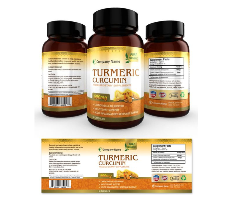
Use clear glass to showcase the vibrant yellow color of the turmeric powder inside, reinforcing the product’s quality and freshness. polished metal lids in gold or silver finishes to enhance the premium feel. Gold lids can add a touch of elegance and align with the luxurious branding.
Source: https://in.pinterest.com
Source: https://in.pinterest.com
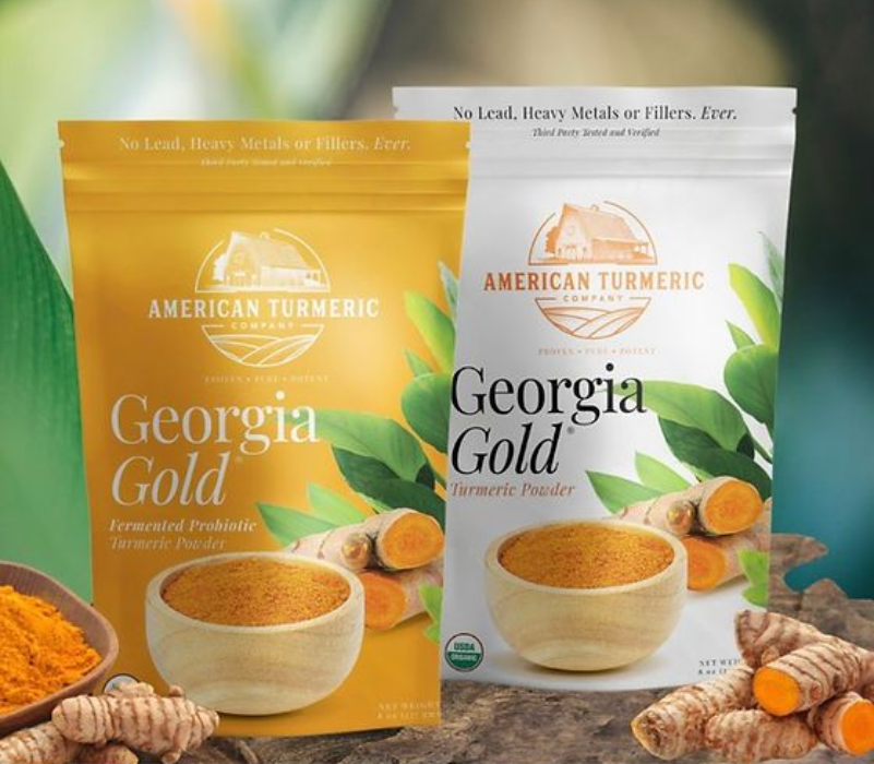
35+ Turmeric Powder Packaging Design Ideas
Source: in.pinterest.com
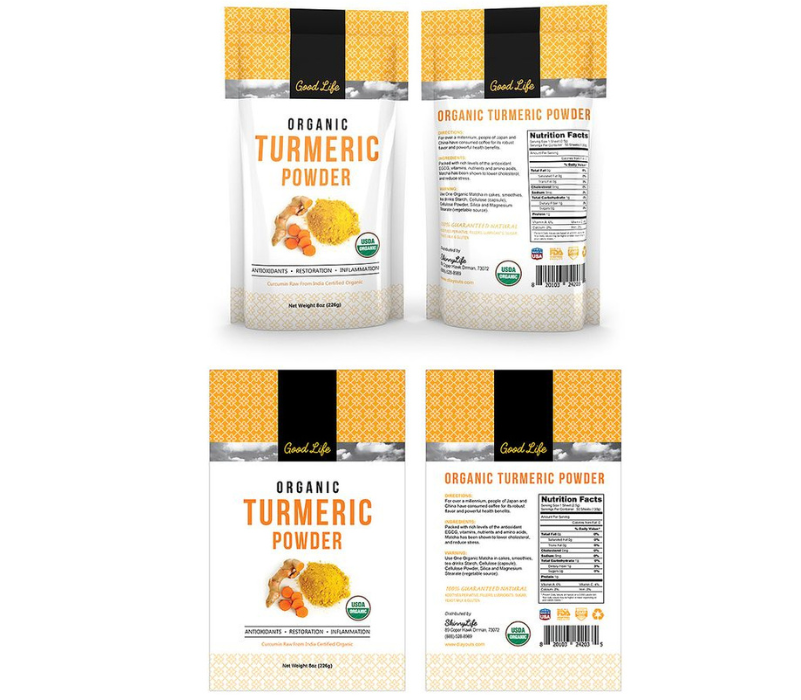
Source: in.pinterest.com
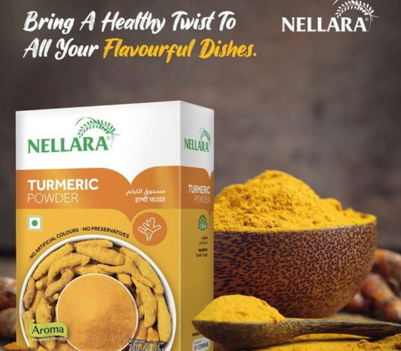
Source: in.pinterest.com
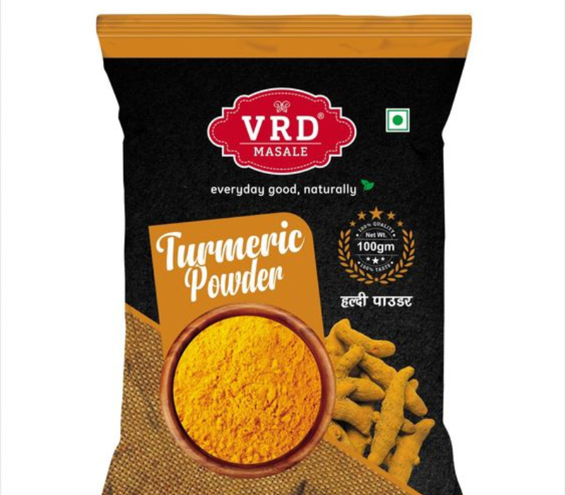
Source: in.pinterest.com
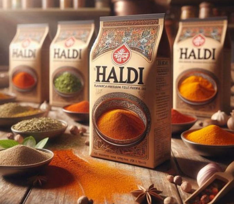
Source: in.pinterest.com
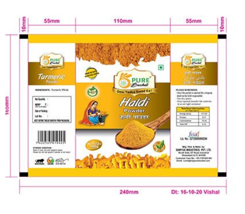
Source: in.pinterest.com
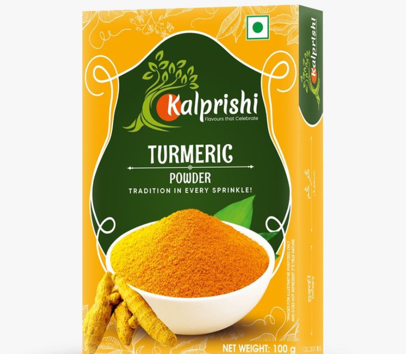
Source: in.pinterest.com
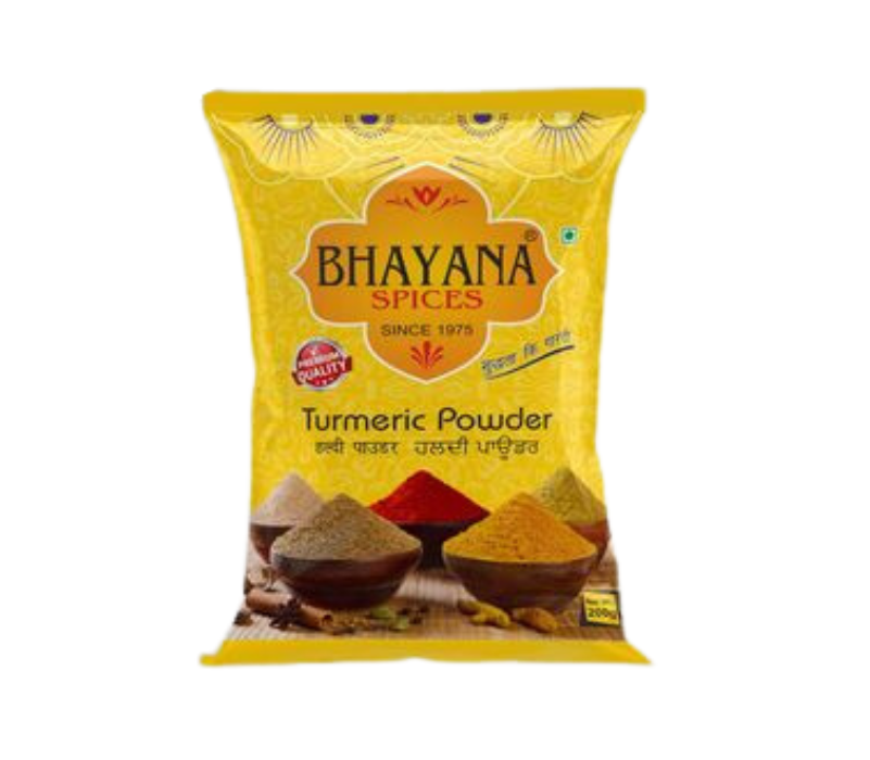
Source: in.pinterest.com
Conclusion
In today’s competitive market, turmeric powder packaging needs to do more than just protect the product—it should communicate quality, heritage, and uniqueness. Whether you’re opting for eco-friendly pouches, luxury glass jars, or culturally infused designs, it’s important to balance aesthetics with functionality.
So, don’t settle for basic packaging! Stand out on the shelf with bold colors, cultural patterns, and premium materials that highlight your brand’s value. Ready to elevate your turmeric packaging? Contact us today and let’s create a design that truly resonates with your audience!

